Portfolio

Engage more customers and convert more sales with StoryBranded marketing.

Darts 10 points

How You Structure Your Website Matters

You probably already know having a website is important.
‍But did you know that the way you design your website can exponentially affect
whether people actually engage with your business?


We specialize in creating StoryBranded websites.
A StoryBranded website uses a 7-part framework based on story
to ensure each website not only looks nice, but generates sales as well.

Our Previous Work

Filter by category:
Clear filters
Thank you! Your submission has been received!
Oops! Something went wrong while submitting the form.

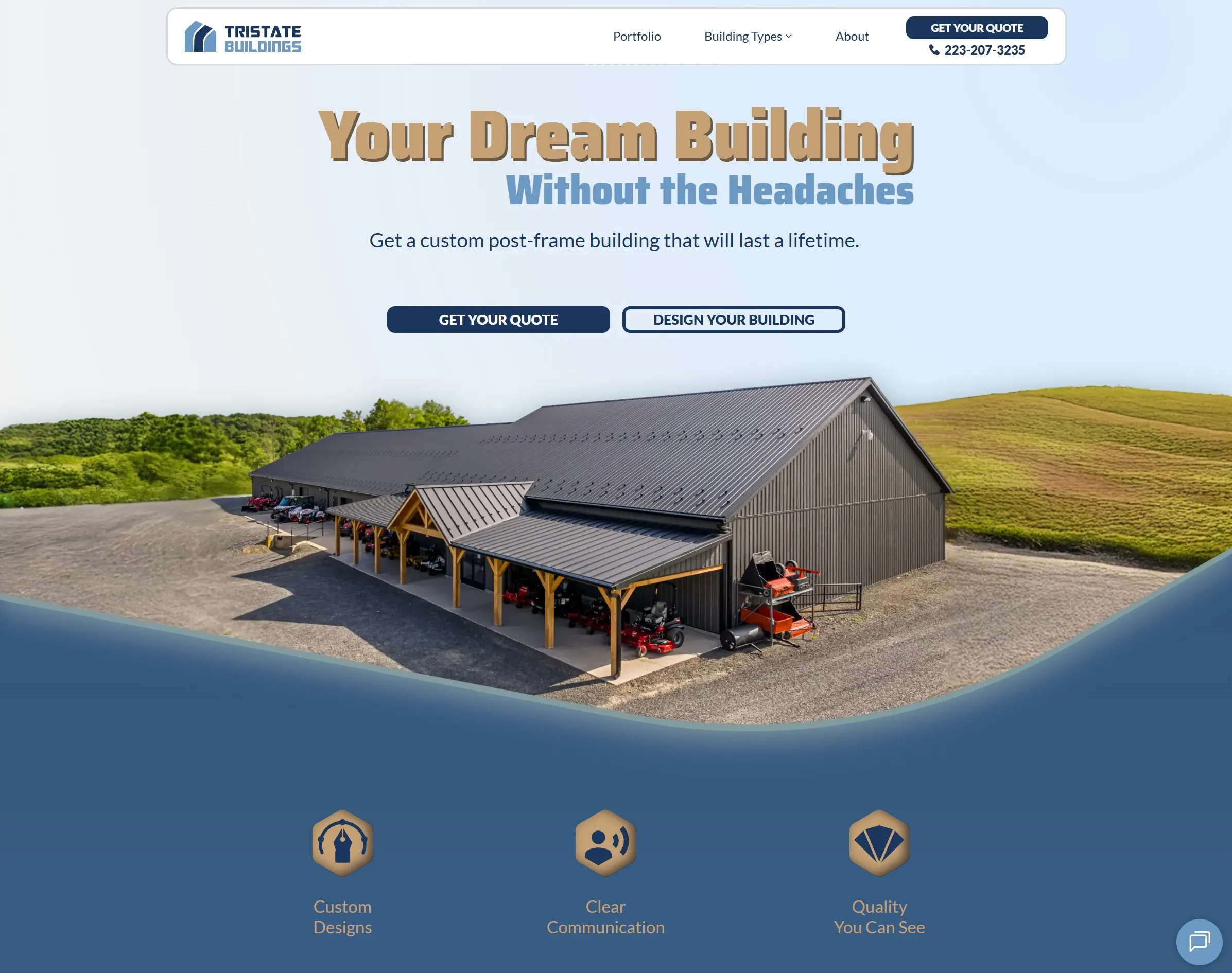
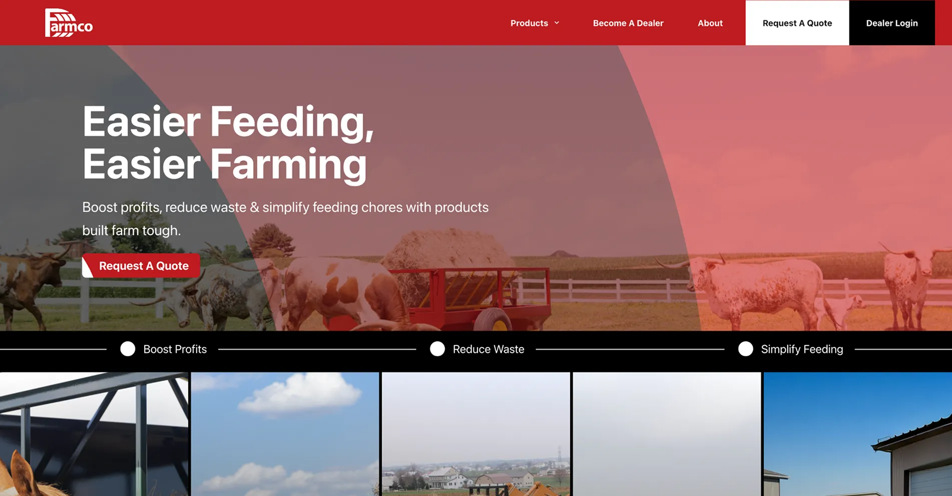
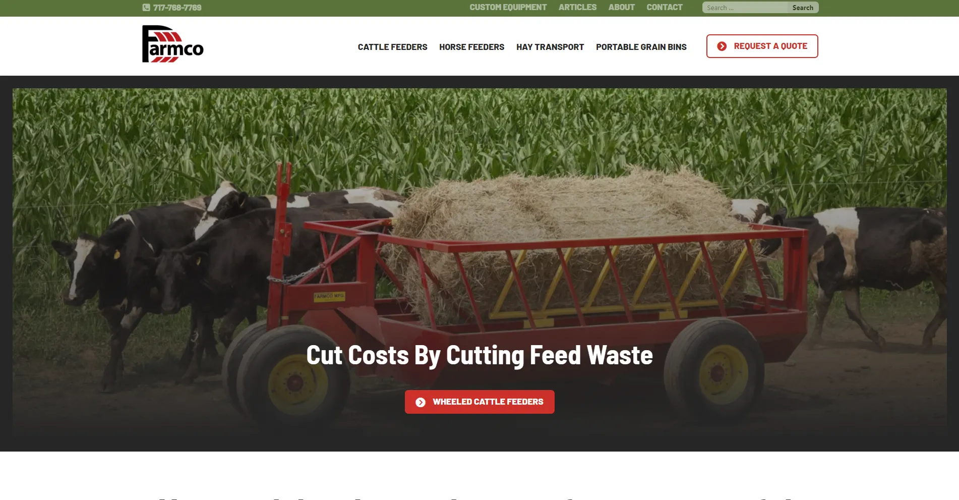
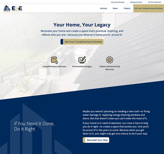
Tristate Buildings

For Tristate Buildings, we gave them a complete rebrand, created a custom StoryBranded website, and set them up with ongoing SEO services so they can increase their Google ranking, attract more leads, and close more deals. Deliverables: New logo and brand kit | Custom website with new copy and photos | Lead generator | 3D Product builder | SEO services | Customer forms | Email signatures | Company letterheads | Check them out here 👉 https://www.tristatebuildings.com/

More details
Previous slide
Next slide
No items found.
Drag to switch netween old and new design

Tristate Buildings

For Tristate Buildings, we gave them a complete rebrand, created a custom StoryBranded website, and set them up with ongoing SEO services so they can increase their Google ranking, attract more leads, and close more deals. Deliverables: New logo and brand kit | Custom website with new copy and photos | Lead generator | 3D Product builder | SEO services | Customer forms | Email signatures | Company letterheads | Check them out here 👉 https://www.tristatebuildings.com/

View website hereClose

Five Star Sheds

For this client, we did a website refresh by replacing their outdated site with a custom StoryBranded website that presented a clear and compelling message. In addition to the home page, we wrote unique copy for the About page and created custom pages for each type of shed sold. Plus, we added unique location pages talking more about their various store locations throughout Arizona. Lastly, this project included a rebrand involving a new logo and color palette. 👉 https://fivestarshedsaz.com/

More details
Previous slide
Next slide
No items found.
Drag to switch netween old and new design

Five Star Sheds

For this client, we did a website refresh by replacing their outdated site with a custom StoryBranded website that presented a clear and compelling message. In addition to the home page, we wrote unique copy for the About page and created custom pages for each type of shed sold. Plus, we added unique location pages talking more about their various store locations throughout Arizona. Lastly, this project included a rebrand involving a new logo and color palette. 👉 https://fivestarshedsaz.com/

View website hereClose

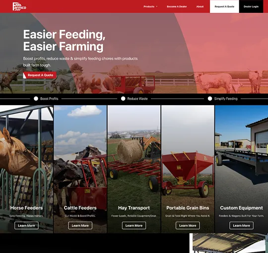
Precise Builder

For Precise Builder, we created a brand kit and guidelines, plus designed, wrote copy for, collected photos, and built a custom StoryBranded website. 👉 https://www.precisebuilder.com/

More details
Previous slide
Next slide
No items found.
Drag to switch netween old and new design

Precise Builder

For Precise Builder, we created a brand kit and guidelines, plus designed, wrote copy for, collected photos, and built a custom StoryBranded website. 👉 https://www.precisebuilder.com/

View website hereClose

Chazak Rescue

For this non-profit organization, we took a muddled, outdated website and transformed it into a website that keeps people coming back via compelling copy and a brand-new custom web design. DELIVERABLES: Website Copy | Website Design | Website Development | Lead Generator | View the Chazak Rescue website here 👉 https://chazakrescue.org/

More details
Previous slide
Next slide
No items found.
Drag to switch netween old and new design

Chazak Rescue

For this non-profit organization, we took a muddled, outdated website and transformed it into a website that keeps people coming back via compelling copy and a brand-new custom web design. DELIVERABLES: Website Copy | Website Design | Website Development | Lead Generator | View the Chazak Rescue website here 👉 https://chazakrescue.org/

View website hereClose

Chazak Academy

For this non-profit, we transformed dreams into a reality via an attractive website that speaks clearly and invites visitors into a lasting relationship. DELIVERABLES: Website Copy | Website Design | Website Development | Lead Generator | View the Chazak Academy website here 👉 https://chazakacademy.org/

More details
Previous slide
Next slide
No items found.
Drag to switch netween old and new design

Chazak Academy

For this non-profit, we transformed dreams into a reality via an attractive website that speaks clearly and invites visitors into a lasting relationship. DELIVERABLES: Website Copy | Website Design | Website Development | Lead Generator | View the Chazak Academy website here 👉 https://chazakacademy.org/

View website hereClose

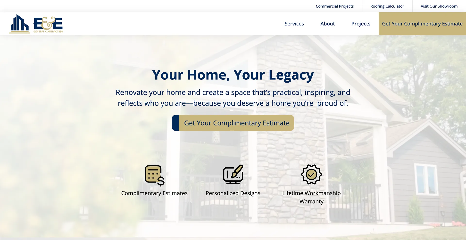
Crossroads Constructions

We helped this client attract more customers by creating a clear and compelling homepage that invited new and old customers alike into purchasing their products and services. DELIVERABLES: Home & Portfolio Page Copy | Home & Portfolio Page Design | Home & Portfolio Page Development | SEO | Social Media Management | View Crossroads Construction website here 👉 https://crossroads-construction.com/

More details
Previous slide
Next slide
No items found.
Drag to switch netween old and new design

Crossroads Constructions

We helped this client attract more customers by creating a clear and compelling homepage that invited new and old customers alike into purchasing their products and services. DELIVERABLES: Home & Portfolio Page Copy | Home & Portfolio Page Design | Home & Portfolio Page Development | SEO | Social Media Management | View Crossroads Construction website here 👉 https://crossroads-construction.com/

View website hereClose

Reforgd

We helped this client gain clarity around where he wanted to take his company. Then, we created a clear way to communicate the six different brands within his company. DELIVERABLES: Business Name | Logo | T-shirt Design | Brand Guidelines | Colors | View the reFORGD website here 👉 https://www.reforgd.com/

More details
Previous slide
Next slide
No items found.
Drag to switch netween old and new design

Reforgd

We helped this client gain clarity around where he wanted to take his company. Then, we created a clear way to communicate the six different brands within his company. DELIVERABLES: Business Name | Logo | T-shirt Design | Brand Guidelines | Colors | View the reFORGD website here 👉 https://www.reforgd.com/

View website hereClose

Starlux

We transformed a cluttered and confusing ad into a modern and clear advertisement that helped the company stand out and attract more customers.

More details
Previous slide
Next slide
No items found.
Drag to switch netween old and new design

Starlux

We transformed a cluttered and confusing ad into a modern and clear advertisement that helped the company stand out and attract more customers.

View website hereClose

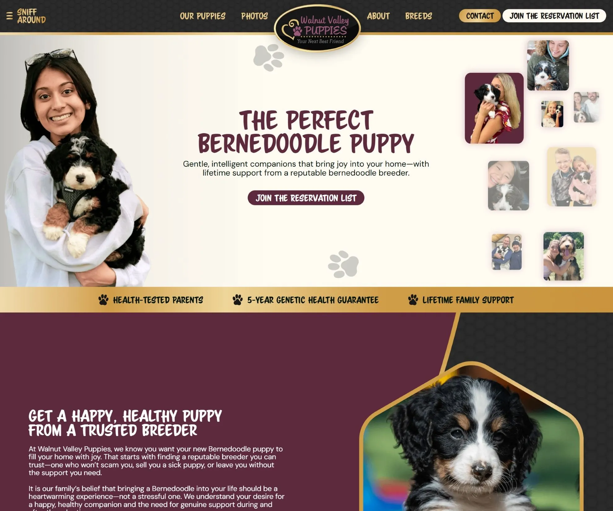
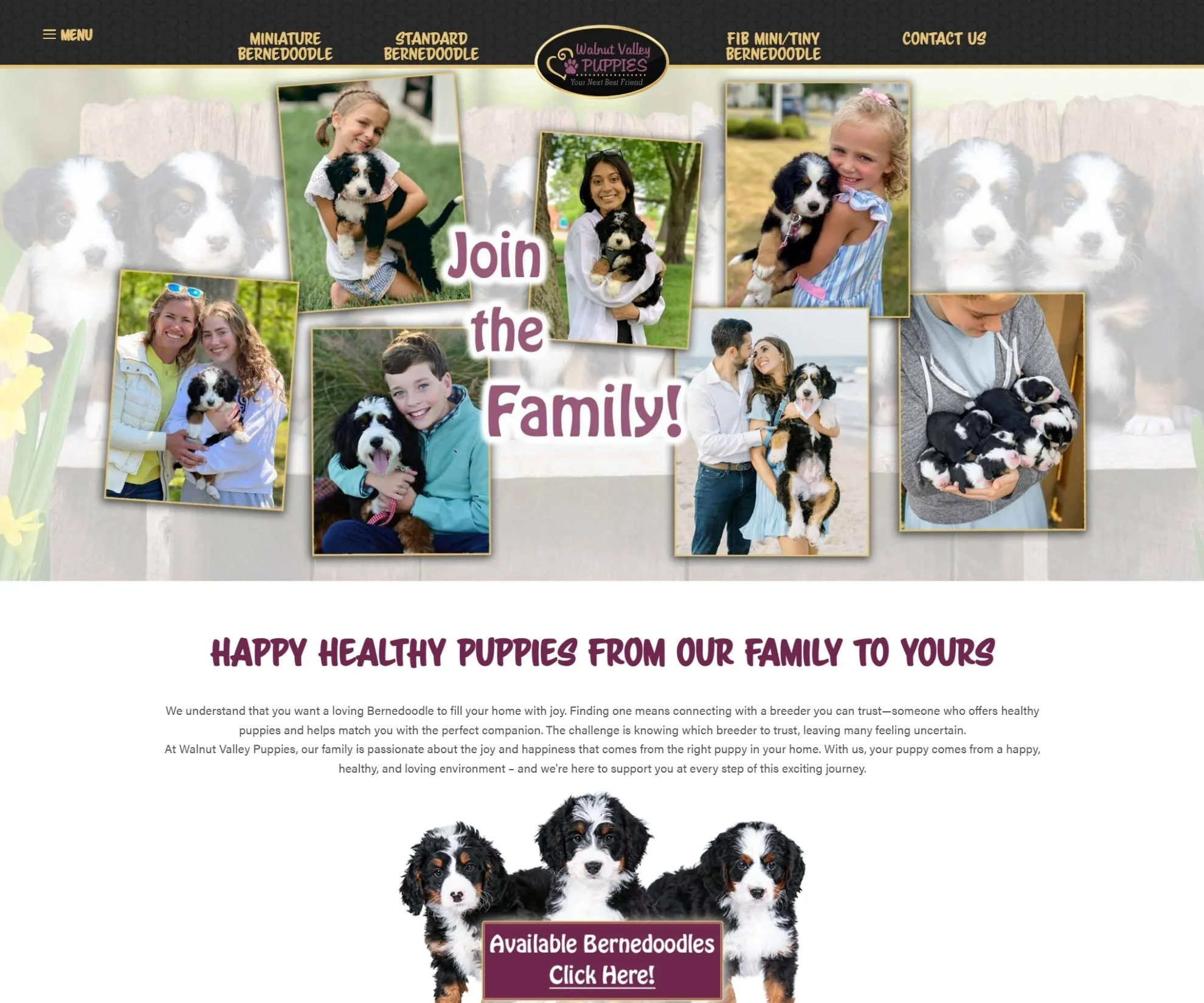
VIP Puppies

We did a site refresh for this client with a custom home page, new copy throughout the site, and fresh and attractive photos. We clarified the message and spoke more clearly to the customer, thus setting the company up for more sales and greater profits. Lastly, we set up security features so people can finally purchase their dream puppy without fear of being scammed! 👉 www.vippuppies.com

More details
Previous slide
Next slide
No items found.
Drag to switch netween old and new design

VIP Puppies

We did a site refresh for this client with a custom home page, new copy throughout the site, and fresh and attractive photos. We clarified the message and spoke more clearly to the customer, thus setting the company up for more sales and greater profits. Lastly, we set up security features so people can finally purchase their dream puppy without fear of being scammed! 👉 www.vippuppies.com

View website hereClose

Beiler Gutters

For years, Beiler Gutters had no online presence. Now they’re sporting a lead-generating website that best showcases their company and products.

More details
Previous slide
Next slide
No items found.
Drag to switch netween old and new design

Beiler Gutters

For years, Beiler Gutters had no online presence. Now they’re sporting a lead-generating website that best showcases their company and products.

View website hereClose

8 Point Hunting Blinds

From a simple Facebook page to a completely custom website featuring an interactive map for finding a dealer. Here’s where 8-Point Hunting Blinds is today.

More details
Previous slide
Next slide
No items found.
Drag to switch netween old and new design

8 Point Hunting Blinds

From a simple Facebook page to a completely custom website featuring an interactive map for finding a dealer. Here’s where 8-Point Hunting Blinds is today.

View website hereClose

Twin Valley

Twin Valley Woodcrafts received a total website overhaul along with modern branding including new logo, brand colors and brand guidelines.Check it out.

More details
Previous slide
Next slide
No items found.
Drag to switch netween old and new design

Twin Valley

Twin Valley Woodcrafts received a total website overhaul along with modern branding including new logo, brand colors and brand guidelines.Check it out.

View website hereClose

Rockingham Gutter

A brand new company needs a brand new website. And that’s exactly what this Virginia-based home exterior business got.

More details
Previous slide
Next slide
No items found.
Drag to switch netween old and new design

Rockingham Gutter

A brand new company needs a brand new website. And that’s exactly what this Virginia-based home exterior business got.

View website hereClose

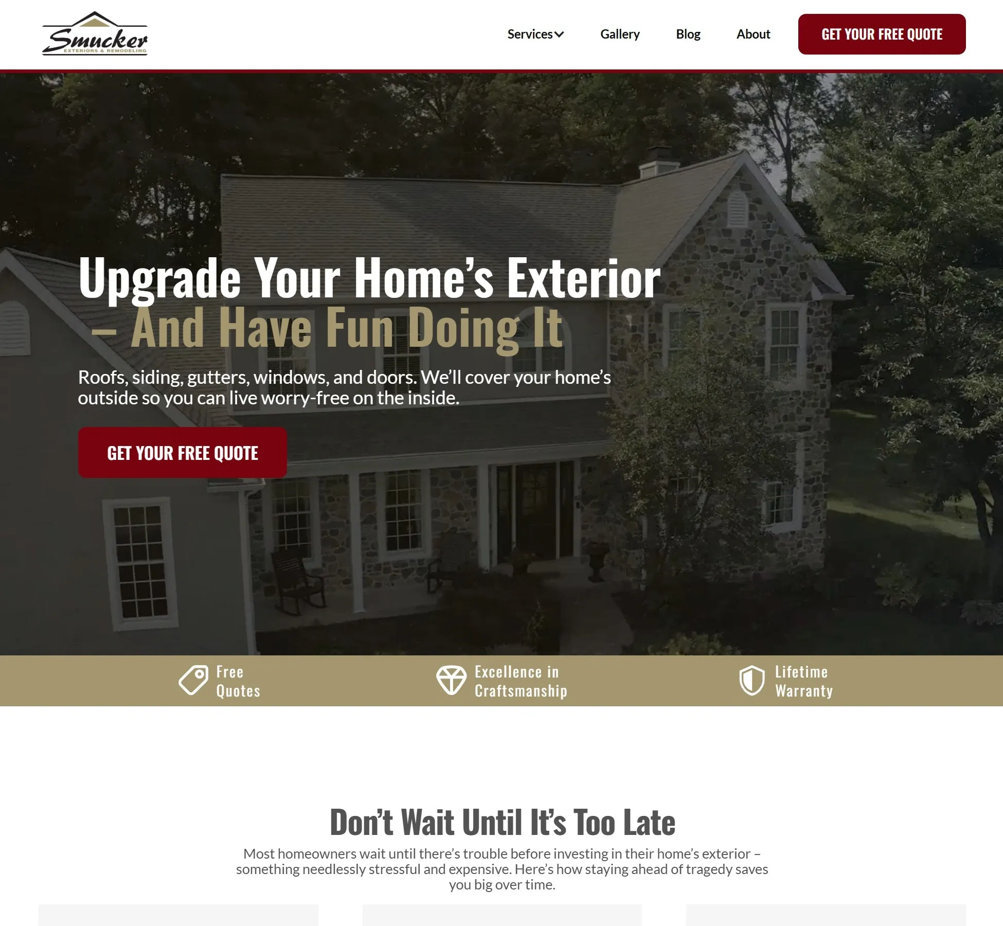
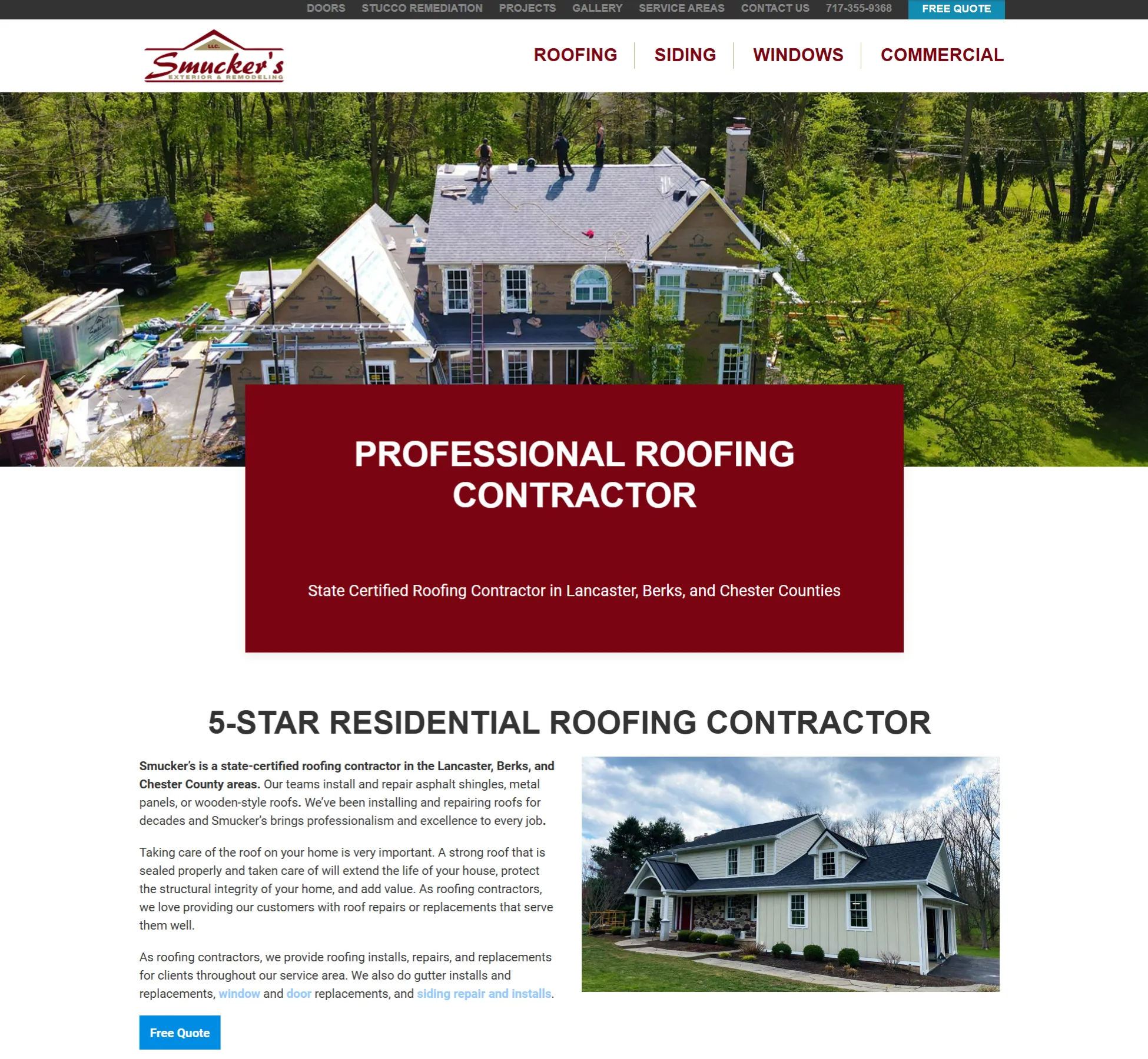
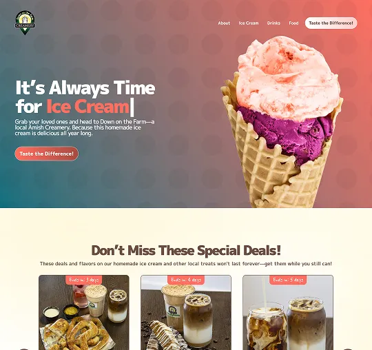
Ten Point Home Improvements

Wanting to update the company’s web presence, Ten Point Home Improvements now sports an attractive, modern website. (Sure beats the old Facebook page.)

More details
Previous slide
Next slide
No items found.
Drag to switch netween old and new design

Ten Point Home Improvements

Wanting to update the company’s web presence, Ten Point Home Improvements now sports an attractive, modern website. (Sure beats the old Facebook page.)

View website hereClose

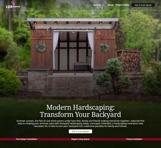
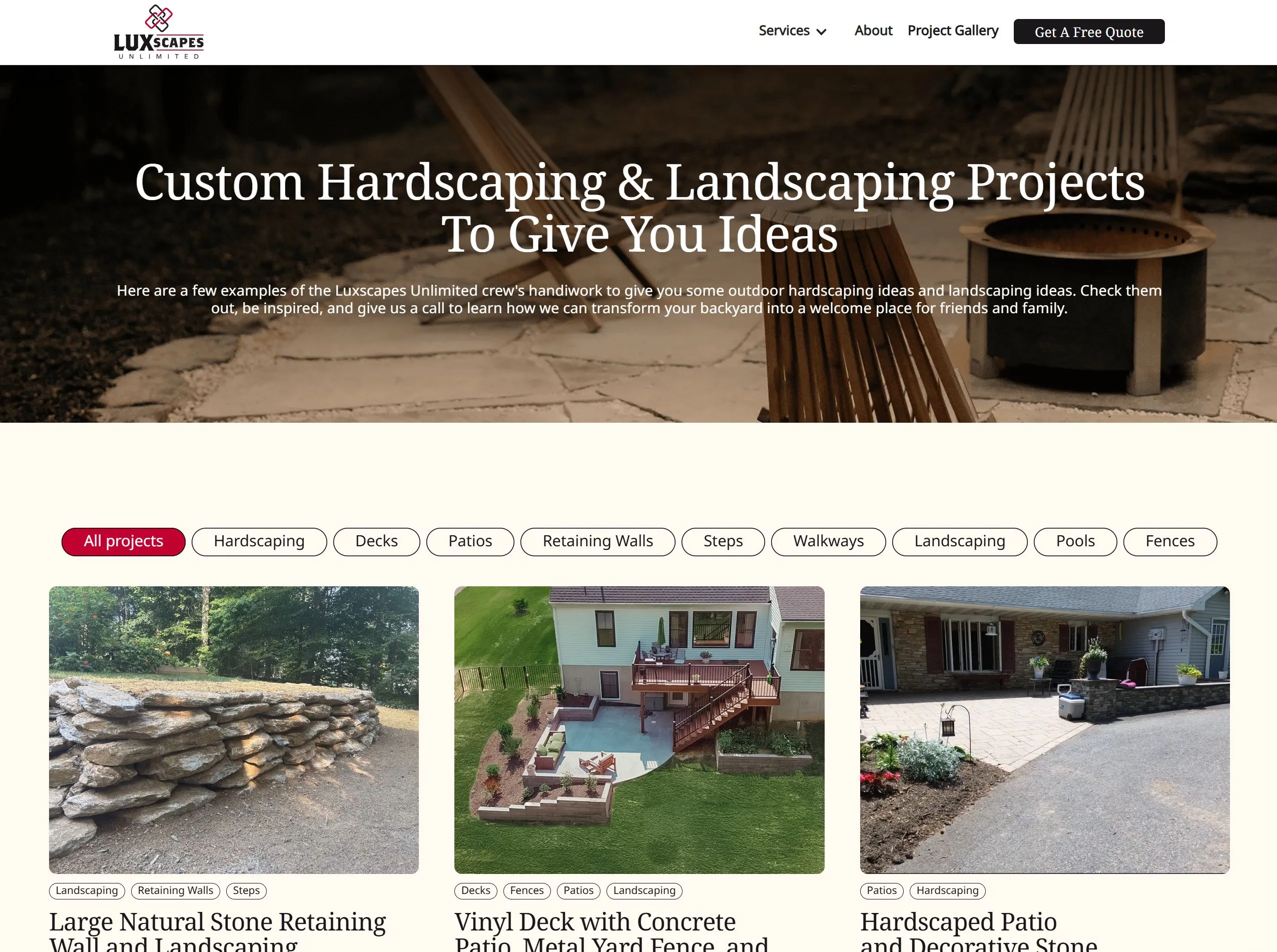
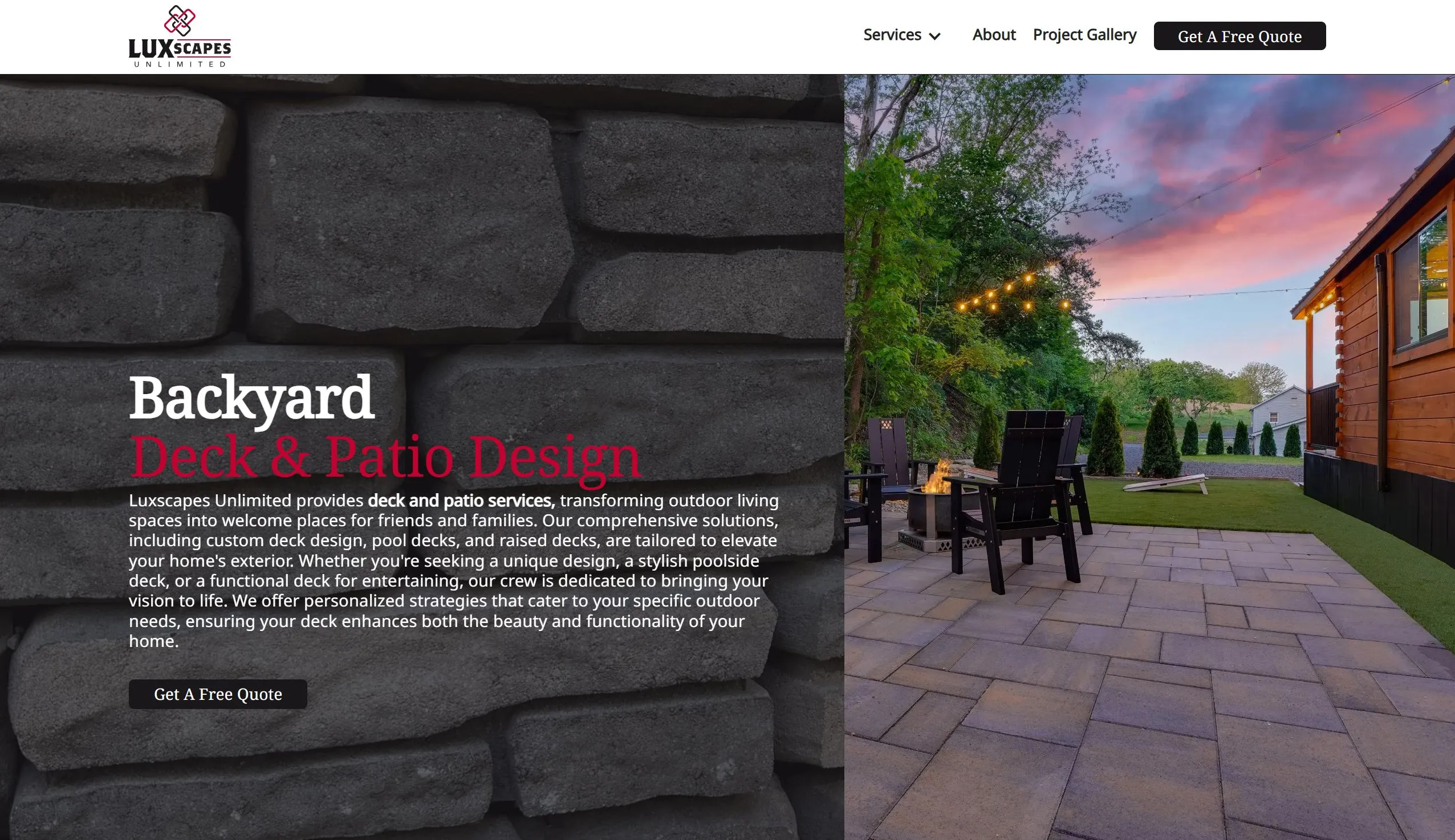
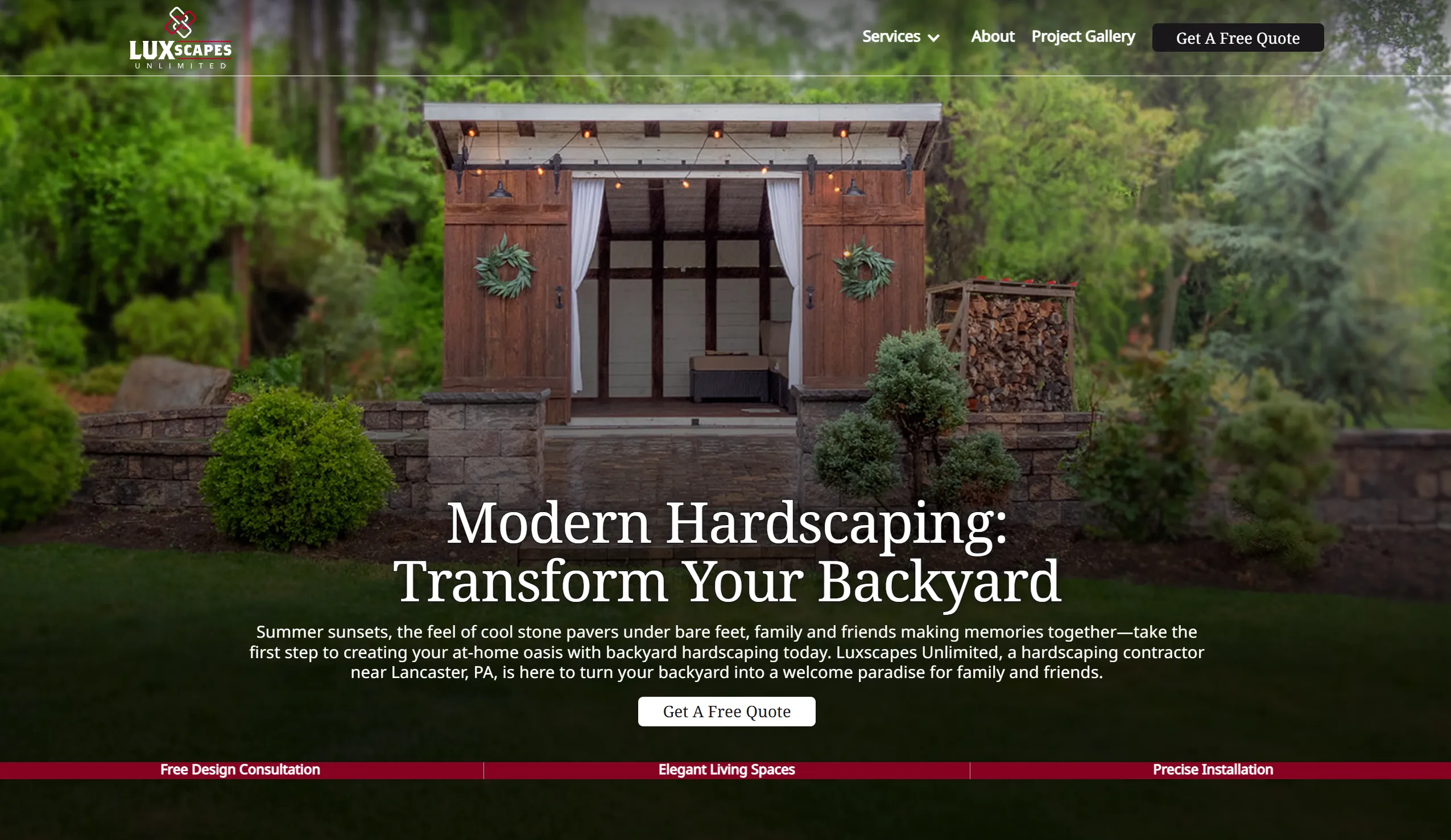
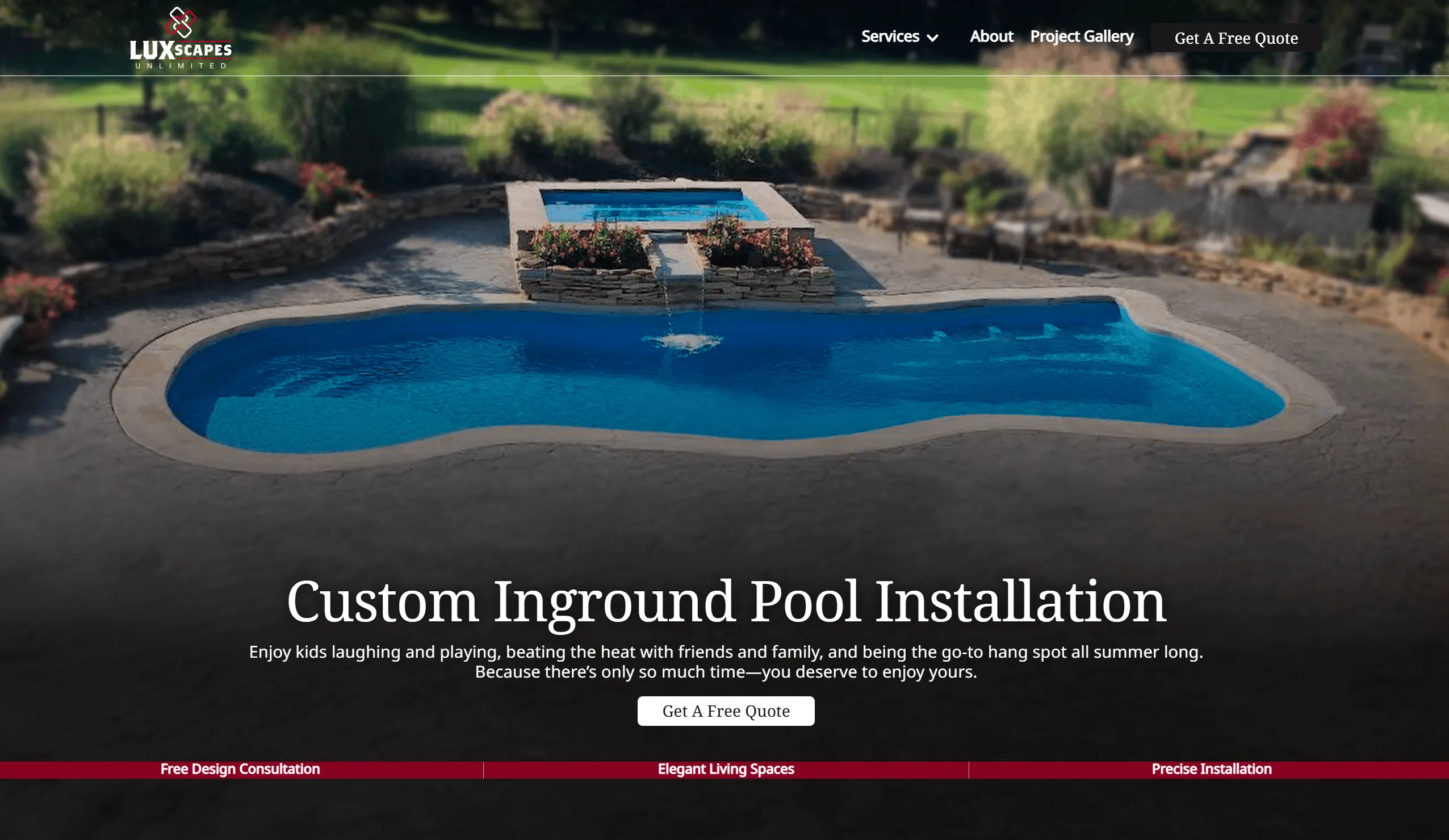
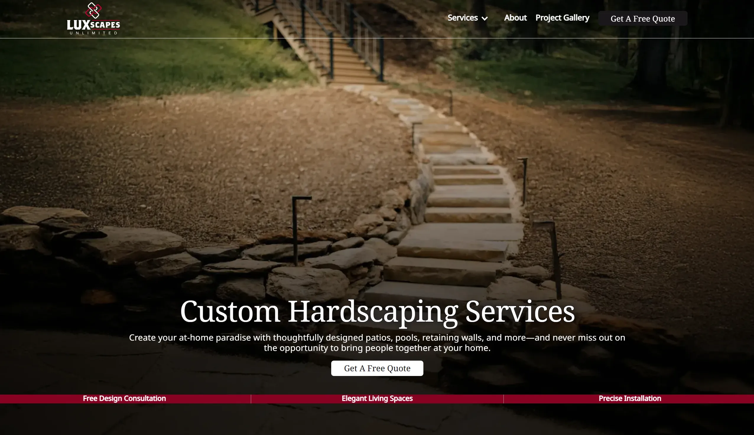
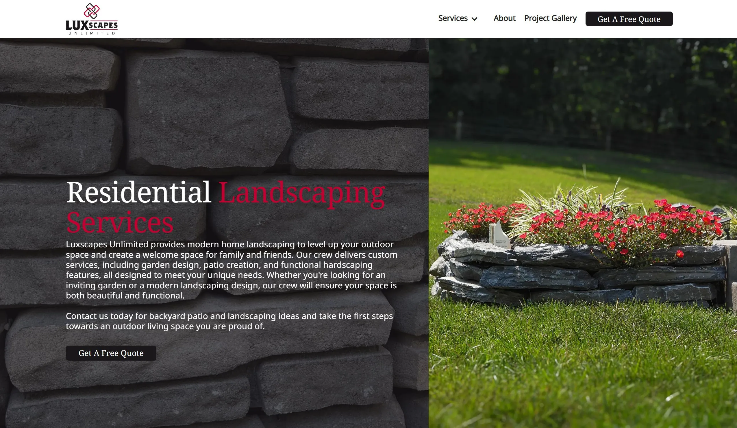
Luxscapes Unlimited

The hardscaping professionals at Luxscapes Unlimited wanted to transform more than a few homeowners’ backyards. Now they’re offering their services with a fully custom website.
More details
Previous slide
Next slide
No items found.
Drag to switch netween old and new design

Luxscapes Unlimited

The hardscaping professionals at Luxscapes Unlimited wanted to transform more than a few homeowners’ backyards. Now they’re offering their services with a fully custom website.
View website hereClose

Smoke Ring BBQ

Smoke Ring BBQ was a startup in need of a logo. Our team delivered with a "fire" logo, putting Smoke Ring BBQ well on the way to creating a strong brand for themselves.

More details
Previous slide
Next slide
No items found.
Drag to switch netween old and new design

Smoke Ring BBQ

Smoke Ring BBQ was a startup in need of a logo. Our team delivered with a "fire" logo, putting Smoke Ring BBQ well on the way to creating a strong brand for themselves.

View website hereClose
No results found

Grow Your Sales with a StoryBranded Website

Engage more customers and sell more of  your products or services with a storybranded website.
1

The Header

The header is the very first thing people see when landing on your website and is by far your most important section. Whether viewers decide to do business with you largely hinges on whether your header causes them to engage.

Key pieces to an engaging header section include:

  • An engaging image that reflects the feeling of success your customers will have after doing business with you
  • Few words. . .but the right words

Plus, your header should pass the "grunt test".

Simply put, the grunt test is whether or not a potential customer can "grunt" a quick and easy answer to the following three questions upon landing on your page:

1. What do you do?
2. How does it make your customer's life better?
3. Where (or how) does your customer get your product or service?

2

Stakes


The stakes section of your website is where you communicate what's at stake. For example, what failures do you help your customers avoid? Alternatively, what success do you help your customers achieve?

Some may wish to communicate this in a sentence or two. Others might lay it out as a value stack like the example here.

It's also possible to lay out a value stack showing valuable features of your product or service followed by a sentence or two communicating what's at stake.

The structure is up to you, but remember: the stakes section serves the purpose of amplifying your customer's need to resolve the problem they are facing.

3

Value Proposition

After having amplified your customer's need to resolve the problem they are experiencing, you can re-introduce the solution your business provides. This is where you state your concise one-liner.

Your one-liner looks something like this:

"Most people want [the character aspiration from your brand script]. The problem is [the external problem from your brand script]. This makes them feel [the internal problem from your brandscript]. At [the name of your business], we make it easy to [the success you bring as listed in your brandscript].

The value proposition is longer than your header, but you still don't want to get wordy in this section. Keep it clean and clear. It can also be good to include another call to action (CTA) button at the bottom of this section.

4

Guide

Now that you've just told your customer about the value you can bring, follow up with the guide section.  

Your guide section is where you demonstrate your experience.

It's where you express empathy for your customers and the problem they are facing and then present yourself as their guide to overcoming their problem.

To do this, you can:
- Share in a paragraph or two what you have done and accomplished
- List testimonials of past customers who experienced success by having done business with you
- Present authority by displaying logos of companies you have worked for or badges of awards you have won

To get you started, here is an example of a StoryBranded guide section.

5

Plan

By now, you have amplified the problem, presented the solution, and established your authority. Next up, it's time to show your customers how they can experience the successful transformation your business offers.

It's time to lay out the plan.

Remember to keep the plan simple. An effective plan has three to four easy-to-follow actions to achieve the transformation you promise.

Remember to follow up your plan with a direct CTA.

For reference, here is an example of a StoryBranded plan section. Note how step three paints a clear picture of success for the customer.

Book a coach

Lead a high performing team

Increase business revenue

6

Explanatory Paragraph

At this point in the website, you have laid out your brandscript well. You presented the aspiration, amplified the problem, offered the solution, demonstrated your competency in helping them solve their problem, and gave them an easy-to-follow plan for doing business with you.

Believe it or not, even though by this point you've amplified the problem, offered a solution, demonstrated your competency, and given an easy-to-follow plan for doing business with you, some potential customers will still not be convinced to do business with you.

This is where the explanatory paragraph comes in.

The explanatory paragraph gives you the opportunity to go more in-depth. It's your brandscript in longer, written form. In this section, be sure to:

  • Flesh out your customer's story a little more. Agitate the problem from different angles. Go deeper into the solution your business offers and the process you use. Share more of your experience to further establish authority.
  • Add SEO. This is the section where you can embed keywords and optimize your website for search engines.
  • Answer possible questions. As potential customers continue exploring your website, they will begin to have questions. The explanatory paragraph is where you can start answering these questions. You can either do it in paragraph form, list the questions in an accordion menu, or simply state the questions and then link to your FAQ's page.

7

Video

This section is optional. However, for many people, video is more engaging than text. So, scroll through your website and consider ways you can include video.

A video could be included in your header, or you might swap it out with your explanatory paragraph. Alternatively, you could include it with your explanatory paragraph in order to increase the SEO value of your website via written text.

If you do include a video, choose a video that either:

  • Explains your business further
  • Clarifies how you solve your customer's problem, or
  • Shows how your business has helped previous customers

Here is an example of a StoryBranded video section combined with text to improve SEO.

8

Price Choices


This is where you show a simple and clear menu of optional products or services your customers can choose from when they are ready to purchase. Customers like to be able to choose between options, so give them some. Businesses will often list three to five options.

The price choices section should include a direct CTA with each option. These CTAs will then send them directly to the payment page.

9

Lead Generator

Again, not all potential customers will be convinced to do business with you even by this point in your website. But that doesn't mean they are not interested.

So, it's a good idea to include a secondary CTA that allows you to get your customer's contact info even if they haven't purchased anything yet. That way you can follow up with them later.

The most common way to do this is by providing what is called a "lead generator."

A lead generator is a free product or service a potential customer can access immediately upon filling out their email. The most powerful lead generators are products or services that help potential customers and can be implemented right away.

Here is an example of a StoryBranded lead generator section.

10

Junk Box

This brings us to the bottom of your StoryBranded website. We call this the "junk box" because it is where you list all the other odds and ends to your website. You may list things here as links, menus, or icons.

Here are examples of the types of things you could include in your junk box:

  • About page
  • Blog page
  • Contact page
  • Social media pages
  • Service locations page

Build Your Storybranded Website

A website is the number one marketing asset for your business, regardless of whether you do business in person or online. But how do you create a website that actually generates leads and increases sales?
By building A Storybranded website.
Let's get started.

Get a free website audit on us.

We will take a look at your website and give you tips to improve it, allowing you to convert your website traffic into sales!

By submitting this form, you agree to our privacy policy and terms of service.

Cheers!
Your website has been sent for auditing.
Oops! Something went wrong while submitting the form.
Close popup